Agape Acupuncture
Redesign Website
I do love to get acupuncture therapy! I have been getting acupuncture since I was a young adult. My long time therapist recently retired and sold her practice to a young couple with a growing family. Of course, I gave them the opportunity to earn my trust as a client. I have to say that they do an excellent job.
I wanted to help them to transition to their new location and to help them to grow their business by redesigning their website. Below is the before video of the previous website for you to view.
I conducted 3 hours of research online to learn how other professionals in this field market their businesses. I was not very impressed. Most website were very text heavy with many images of needles and smoke and they were quite freighting. To be honest, if I did not have such a rich background as a patient of what acupuncture and related therapies really entail, I cannot say that I would be encouraged to book an appointment!
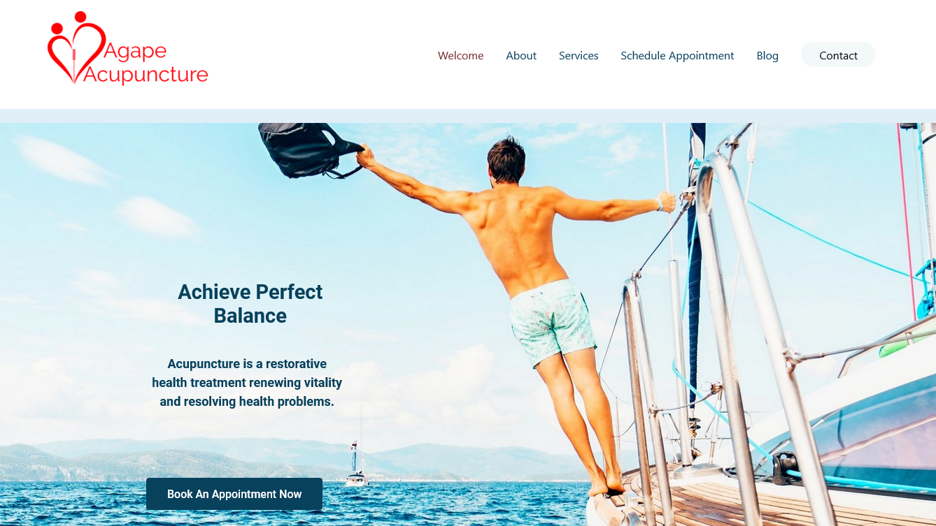
The color scheme is so important visually to invite and calm your user. I did highly disagree with the color of the clients logo in red. I changed it to a green/blue color, but they were attached to the red logo so I did keep it for them. I brought in new colors to balance the red into the overall color scheme so that the mix of color would create a cool and serene feel using blue to anchor the scheme to promote trust and caring.
The client also liked to use Square for the appointment bookings so we kept that in place, although I was happy to create a booking appointment program for them.
Finally, the use of video can really slow down a website so the benefit to the user must be very high. In this case, the benefit and the need for video are very high because there is a misunderstanding about acupuncture and related therapies so educating their clients is a huge priority.
I hope that you like the new Agape Acupuncture website. Use my name as a referral and you will get 20% off your first visit at their clinic. Please click on the link to the new website above left on the link or image.
This was my first time working with a web designer. Julie made my first experience very pleasant.
She is very knowledgeable in what she does and tries to meet my needs and expectations as best as she can. I am not very good at making decisions but she made it easy for me to make decisions, as well as make decisions for me, as necessary.
She is respectful of my wishes and needs and won’t rest until I am completely satisfied. She has reasonable pricing and worked with my tight budget. Thank you, Julie!
Semin John Park


